Wednesday, August 29, 2012

Case Study - A Regular House

Most people do not decorate with the motive to be magazine worthy, or create some kind of imaginary lifestyle, or to show their handiwork on their blog. Most people shop at big box stores, on big box store budgets, not on "tastemaker" sites like OKL, Joss, etc. Most people live in suburban sprawls with houses that look the same in subdivisions and gated communities. And fewer people than you think actually read shelter magazines, and even know what a blog is. Maybe they watch HGTV, but even that is a long shot.

My sister's house is a one level suburban bungalow with a split floor plan. The living room, dining room-kitchen, and family room are open to each other. The master bedroom is split from the other two bedrooms. There are two bathrooms, and  yard and patio, and a garage. The house has tone of storage space. I like the way she angled the furniture in the living room that echoes the angle of the wall.

Yet, even comfortable and attractive homes are out there, even if they are not trendy, stylish, and designer. I am staying in one such home, the home of my sister.

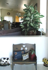
This is the entry hall with a little bench that belonged to our mother. The pony wall backs up to the couches in the living room, so the large plant softens the exposure of the room when the front door is opened, acting as a privacy screen.

We both had the same mother, who influenced us in similar ways. Our mother loved to make our home look cute, rearrange the furniture, and collect knick-knacks. She taught us to be excellent housekeepers, from shopping wisely to cleaning and cooking. She taught us that even if we were on a budget and had to make-do, things could still be (and should be) cute.

The living room looking toward the front door. See how great the angled furniture works. The "curio" cabinet was our mother's and my sister treasures it and its contents which also belonged to our mother. I love the whimsy of the giant cat sculpture. The toss pillows are nice colors, and the area rug breaks up the sea of wall-to-wall carpet. I love that my sister is comfortable not matching all the furniture, and how she groups her pictures on the walls.

So I present these images with an analysis of all the good design principles that my sister uses. She is instinctive, not trained. She lives in a rental. She is working class and does not have much money.

The "curio" cabinet and that fab cat

This is the guest room. comfortable and coordinated. Most people do have matching bedroom furniture sets.

This is my sister's granddaughter's bedroom. She loves pink like most little girls do, and this room works on every level. Furniture placement is spot-on, and the accessories are wonderful. This is a real kids room with posters on the wall and a stuffed animal collection.

I love being in her home. It is visually pleasing and comfortable and so well taken care of. There is a melange of furnishings that she has acquired over the years, some of my mother's things, some pass-along pieces, and the bulk purchased at big box discount stores.

This is the dining area. These pub style counter height tables are very popular. My sister added the chandelier to this rental house.

This is the kitchen. Note the cow head with horns. My sister has had this for 20 years, and another family member hand painted sunflowers on it. My sister has a thing for sunflowers and collects decorative objects with them on it.

How many houses have walls and cabinet situations like this, begging for things to be placed on them. I love how my sister styled all of this. It's cozy and softens the odd small walls that builders love to use in houses like these.

My sister's plate collection is perfectly hung in the dining area. I love how she went over the window.  I apologize for all my less than perfect photos. But I am sure you can appreciate the composition of how the plates are hung.

This little moment in the corner of the dining room is so sweet and interesting. The antique chair was our mother's. The large vase with branches adds a great layer in front of the plate collection. My sister is very good at layering.

Snobs might turn their noses up at a decor like this, but I really think my sister decorates better than most with what she has and in her wheelhouse. She has an eye for color and proportion, and layering and furniture placement. Her collections are unique to her. Magazine worthy? Maybe not. But eminently livable and pretty,

This is the family room at the back of the house. The sectional is great (it came from Big Lots), and there's a tray on the ottoman used as a coffee table, a trend seen in magazines. I love the round paper lantern, it's very Noguchi. Budget does not allow for better window treatments, so my sister keeps it clean and simple.

My sister is great with color. This rug and the pillows on the couch in the family room are great little accents. And yes, there is a leather recliner in the family room. It is a teal green/blue leather, not a usual color choice, again a nod to my sister for taking a risk. and mixing and  matching all the furniture.

This is such a trend - the gallery wall surrounding the big flat screen TV - My sister did a great job.


So I salute all you homeowners out there who never picked up Domino magazine, or read Lonny online, or read my blog (or any other design blog). I salute your natural instincts, and your down-to-earth reality. There is not a thing I would change about you.


Please add my NEW address to your blog list:
http://thevisualvamp.blogspot.com
And please become a Follower again (or for the first time)


Thursday, August 23, 2012

Atelier AM

Michael and Alexandra Misczynski have practiced interior design together in Los Angeles as Atelier AM for a decade. And now there is a gorgeous new book, Interiors Atelier AM, published by Rizzoli with their work in it, and equally gorgeous photos by Francois Halard.

Perfect symmetry - Atelier AM - all photos by Francois Halard


If you love John Saladino, and Rose Tarlow, and Axel Vervoordt, you will love and want this book.

“We’re not decorators, and we’re definitely not shoppers,” says Michael Misczynski,  “We don’t just furnish houses – we detail all the interiors to get it to where we’d like it to be.”

Less is more - Atelier AM


“What I call our work is edited,” Michael says."Less is more is not a bad way to put it.”

That means moldings, cases, bases, doors, hardware, stone and floor patterns and ceilings as well.  The desired effect is a unity and a holistic effect from all.

All the things we love -  Over size lantern, Kooboo chairs, rough table - Atelier AM


“We try to finesse every detail, regardless of what gets dropped in our lap architecturally,” Michael explains, “Whatever the architectural process is, we want to respect it and build upon it.”

Enter a world of interiors by Atelier AM, where classical proportions, varied finishes, and exquisite furnishings are masterfully combined, resulting in bold yet tranquil environments.

The floors are to die for! - Atelier AM

Seventeenth- and eighteenth-century furniture commingle with modernist pieces and ancient objects. Background colors and materials are muted and refined. Interiors Atelier AM showcases a selection of residences—each exhibiting the firm’s skill at mixing furniture and objects with backgrounds such as antique flooring and Venetian plaster, with bold and modern results.

Who wouldn't love this kitchen? - Atelier AM

Some of my favorite photos in the fabulous book I hold in my hands, have not been released for publication.  They are of the New York and Las Vegas houses, and they are to die for. Get a hold of the book so you can see them!

Love the rough texture, and the way the art is displayed - Atelier AM


The floors! The floors! - Atelier AM

Interiors Atelier AM - a must have book for your collection

Please add my NEW address to your blog list:
http://thevisualvamp.blogspot.com
And please become a Follower again (or for the first time)
Tuesday, August 21, 2012

Francois Halard

If you read decor magazines and books and web sites, you will recognize the beautiful work of the photographer Francois Halard. I've done a little round-up of some favorite images (all photos by Francois Halard). Stay tuned for more of this talented photographer's work later this week.

The color and layering int his room are perfectly captured by Francois Halard

This looks like a roof top dining fantasy

Objects on a desk - not as easy as it looks to style and photograph

Reflective surfaces are a challenge to light and photograph

Making odd things beautiful

Looks like a lovely guest room

Ever since the greats like Billy Baldwin used magnolia and gardenia leaf green walls they always come back in style

Wood paneling can look good

Another pretty bedroom - note the animal accessories showing up

The best entry hall photo

The view through the branches is a masterful composition

Symmetry captured perfectly

Capturing the details is an art form

François Halard was born in 1961 in France but now spends time between homes in New York and France. He studied at the École Nationale Supérieure des Beaux-Arts in Paris. Soon after, he began working for Decoration International, and then with Conde Nast art director Alex Lieberman. In 1984, François moved to New York City where he began regular commissions for several Conde Nast publications, including American Vogue, Vanity Fair, GQ, and House & Garden. (from Wikipedia).

Trish South Management represents Francois Halard.

Please add my NEW address to your blog list:
http://thevisualvamp.blogspot.com
And please become a Follower again (or for the first time)

Wednesday, August 15, 2012

Dreaming

Dreaming. As in they must be dreaming. The very target customer for the things they sell, young women, college girls, romantic Boho types, artists, poets, and dreamers, could never afford to buy one piece of their gorgeous furniture. They taunt us with pretty catalogs. And the clever ones, hit the thrift stores, and craft the unattainable priced things in their own way. So I thank them for the dreams and the inspiration.

Hang a large interesting textile on your wall - I love the over dye rug on the floor

Funny styling - the chair looks so teeny - look for the unwanted old man pictures at the thrift store

Get out the stencils and sponges and rags to do a wall like this

Mix those textures!

You can find Suzanis on eBay to reupholster simple chairs with - The bird wallpaper is to die for, but I use inexpensive fabric stapled to a wall for the same effect - I'm still a Boho girl on a budget - Go HERE


Many of you tell me you don't like the plunder practices of this store. Artists get paid what seems like a large sum because they are so often broke, and the corporation reaps the profits forever. I personally think the whole experience is overpriced, and even their oh-so-clever design ethos is wearing thin in being genuine. What do you think? Oh yes, in case you haven't guessed by now, the beautiful photographs and vignettes come from the Anthropologie catalog.

Please add my NEW address to your blog list:
http://thevisualvamp.blogspot.com
And please become a Follower again (or for the first time)

Tuesday, August 14, 2012

A Life Well Lived


Go HERE to see photos of her home.

She was loved.

Helen Gurley Brown

Sunday, August 12, 2012

Sunday By The Sea - The Unhampton Home

This is my kind of house. Actually it has the feeling of the cottage I once owned, and the feeling of a house Sharonne Einhorne owned when she opened her first Ruby Beets on the Montauk Highway in Bridgehampton. Donna Karan also had rich girl version of this type of decor, buying most of the furnishings from Ruby Beets. That was the 1990s.

It's girly and done in a thrift style that reminds one of English cottages. In fact the owner is an English decorator names Podge Bune, who explains her unusual name, "I was a 12-pound baby. When I came out, the midwife said, 'What a podge!' and that was it."

Holy gallery wall! Podge Bune decorates her house in the Hamptons in a untypical way that I love - The stones around the fireplace, the old carved mantle, the tiny boudoir chairs and footstools, velvet used at the beach (!), and all the cosy prints anchored by the symmetry of the mirrors and lamps and pairs of everything used everywhere


Chintz and pink! And I know you love the huge fish wich is an old fishmongers sign

A clever built in bookcase in the dining room - I have something similar in my dining room, but not this nice

You know I am a plate queen just a heartbeat away from being a hoarder, so these are quickening my pulse

Sweet blue chest looks like it might have come out of the old Ruby Beets store on the Montauck Highway

The perfect beach bedroom, complete with a posy of blue hydrangea, the flower most identified with the Hamptons - Where's my long white cotton nightdress?

A very cute bathroom vanity - Note the old mirror and how pretty the very common hardware store handles and knobs are, and of course the chandelier is to die for, all tricked English style with little shades

The back deck with a water view and access - this I did not have - I had to walk across the street and put a two person red kayak in the pond behind The Springs General Store

Podge's water view - Love the weathered driftwood posts

A little garden shed painted green and pink - so very un-Hamptons and so very cute

The picket fence, arch, and rose garden leading up the front walk - I had a picket fence, and brick walkway with two Gothic style iron arches, and my garden was a riot of English flowers, with a stand of sunflowers that got nearly as tall as the arches

The front of the house of Podge Bune is perfection and very un-Hampton

Off you go to House Beautiful to read the entire article by Christine Pittel. It's charming and informative and I know you will like Podge. And here's a link to the slide show with the photos by Francesco Lagnese. The captions are very informative too.

Please add my NEW address to your blog list:
http://thevisualvamp.blogspot.com
And please become a Follower again (or for the first time)