Pantone is not the only one who announces a color of the year. Major paint companies forecast their own trends too. I especially love the
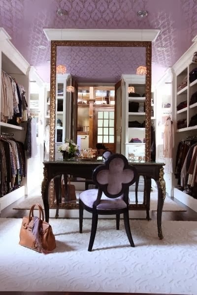
Sherwin Williams 2014 Color of the Year, Exclusive Plum.
Jackie Jordan from Sherwin Williams chooses the color of the year, and she has an insightful article all about it.
Jackie says that she like to choose a storyteller color. She explains, "So what is a storyteller color? It’s a hue that evokes an emotion,
depicts a mood, is emerging in new product roll outs and has endless
possibilities. It’s a color that can be the hero in a space or set the
stage for others to follow. It’s a color that’s being driven by our
desires, our lifestyles, our mindsets and our inspirations. Personally, I
must have complete conviction that the hue I choose for the color of
the year has longstanding potential and appeal."
 |
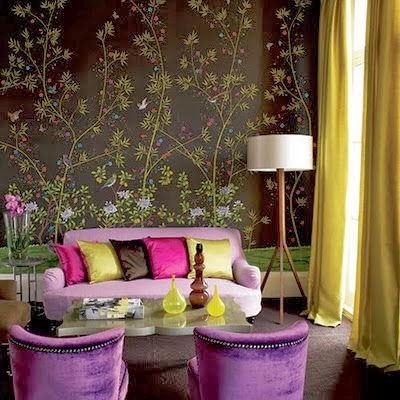
| Green pairs well plum |
Jackie says, "For these reasons and more, I selected Exclusive Plum (SW 6263) for
2014. We’re craving a complex, adult purple that’s both mystical and
curious. A sophisticated hue that evokes elements of romance, drama and
playfulness. Exclusive Plum has enough gray to ground it — to keep it
from looking either too girlish or too overpowering — yet has a depth
and saturation that can take it in many different directions."
 |
| Plum has enough gray to ground it |
I love this color. I have been working with a palette of Sherwin Williams colors for a project where the entire house is getting a paint job. I am taking it from a beige box to nuance and depth and playfulness.
 |
| Plum is modern and traditional at the same time - citrine, green, and magenta pair well with plum |
 |
| Plum with magenta lamps |
Usually I wrap a room in the same color - walls, trim, ceiling, but this time I brought back something classic and old school. I did the trim white, and gasp, I opted for white ceilings! I chose
SW Extra White.
 |
| Plum is sophisticated and enduring |
The palette revolves around one of my
Sherwin Williams favorites, Peppercorn. From there I chose colors with the same value. The color story starts with a lighter gray when you enter the house. It's a shotgun, so the enfilade layout allows a color story to unfold.
 |
| Plum is so romantic and works well in bedrooms |
After the front room, you pass through to the dining room, which got the gorgeous Peppercorn. The kitchen unfolds next, and then a reveal of a long gallery style hallway to the back part of the house. These areas are visually connected, so Peppercorn weaves it way through all these spaces.
 |
| You could just paint the back of bookshelves with plum |
A guest bedroom off the dining room is painted a saturated mid tone blue. This room will be the Palm Beach story, but more of a modern preppy look. A Jack and Jill bath connects to a second bedroom and it was painted the palest of the gray scale. The powder room and laundry room also were painted in this most neutral of all the colors. The second bedroom was painted the same mid tone of the front room.
 |
| Love how the texture of the brick wall is enhanced by painting it plum |
There is a den at the back of the house, and it is also painted the same color as the first room in the house as you enter. It achieves a pleasing "bookend" effect through color.
 |
| How great is this entry hall with one plum area surrounded by green with white trim |
The master bedroom is my favorite after the Peppercorn rooms.
 |
| A color the depth of Peppercorn pairs well with plum |
When you present color suggestions to home owners, they are not as certain as we decorators and designers are. It takes a few samples on the wall, a slew of pictures pinned on
Pinterest, and expressing the confidence of your experience and wisdom.
 |
| White ceilings and trim work so well with plum |
Another gray tone would have been fine for the master bedroom, but I pushed a little and suggest two purple/gray colors. I think a purple/gray is perfect for a room shared by a couple. It is romantic without being cloying.
 |
| Traditional paneling painted plum |
I presented a lighter and a darker choice. At first the man of the house balked at the idea of a "purple" bedroom. But he looked at the Pins, and talked it out. I thought at best, the lighter more "safe" tone might be chosen.
 |
| Plum looks perfect in the great outdoors, since green (this time found in nature) is a complimentary color |
I was in for a surprise. He chose the darker shade! Either would have worked, but the darker shade is the most beautiful.
 |
| Exclusive Plum in a hallway |
So I am checking my email and I get
Jackie Jordan's article about the Sherwin Williams 2014 Color of the Year. I had to laugh a little. It is so close to the color chosen for my project.
 |
| Chartreuse , magenta, orange, gray, white and black accents work well with Exclusive Plum |
It's not Exclusive Plum, but
Soulful Blue. It's more in the violet spectrum. Peppercorn has a very subtle blue undertone, so the colors chosen to stand alongside of it also have that same subtle undertone.
 |
| Plum is a color that is classic and will work well beyond its present color of the year status |
 |
| I plotzed when I saw that Exclusive Plum is the Sherwin Williams 2014 Color of the Year |
 |
| I had just chosen it's kissing cousin Soulful Blue for a current project |
Here is a crappy phone pic of the room being painted. It is going to look killer!
 |
| First coat of Sherwin Williams Soulful Blue |
My local Sherwin Williams store located at 4139 Magazine Street is like having another crew member on my team. They are helpful and patient and fun to be around. I love the quality of the paint, and the color choices are sophisticated. A special shout-out to Blake, Jaci, Keera, and Stephen. I couldn't do my job without you!
So, what do you think of Exclusive Plum?
Hover over any image to Pin it
Please add my NEW address to your blog list: http://thevisualvamp.blogspot.com
And please become a Follower again (or for the first time) on this newer VV blog


