Showing posts with label CUE. Show all posts

Sunday, September 30, 2012

Shaun Smith

A couple of years ago, a very good looking stylish young man came into the shop I was working in. He came in several times, sometimes with his mother. He always gravitated towards the most interesting and best pieces. He purchased a vintage painting, a pair of iron deer heads, and a champagne color cow hide rug. His name is Shaun Smith.

Shaun Smith interior designer

A year or so later he opened his own home furnishings shop, something that did not surprise me in the least. I featured him in a column I wrote for GoNola naming him as one of the "Designing Men of Magazine Street".  His beautiful shop is successful and his reputation as a designer is growing. Most recently his home (which he designed of course) is featured in CUE Magazine (photos by Greg Myles, story by Lee Cutrone).

I love Shaun's style, clean and fresh, mixing masculine and feminine elements, deftly mixing modern, vintage, and antique pieces. Enjoy this little round-up of photos, and go to his web site to see more of his work, and most definitely check out his shop in New Orleans (tell him the Vamp sent you).

Shaun Smith living room

The vintage painting I sold to Shaun Smith

Shaun Smith master bedroom

Another view of the master bedroom - I love how he styled the throw on his bed

Shaun Smith kitchen - The white floors throughout the house are gorgeous - He has an equestrian thing going in the design of his home, echoed in the barn style kitchen cabinet doors

Shaun Smith - breakfast area

Shaun Smith dining room - Love the mix of rough table paired with the French chairs covered in blue velvet, the rock crystal chandelier, the blue and white Chinese pottery, and the modern painting


Please add my NEW address to your blog list:
http://thevisualvamp.blogspot.com
And please become a Follower again (or for the first time)

Friday, June 8, 2012

Chad Graci

Chad Graci is kind of like a New Orleans version of Brad Goreski, in that he is a cute young thing and a dapper dresser. On top of that he is an interior designer starting out his career. Read all about him in the June 2012 issue of CUE Magazine.

Chad is the NOLA Brad - photo by Sara Essex Bradley

Examples of his design work for clients is refined and Uptown, but his own petite pad shows a more exuberant decor personality.

The refined interior design of Chad Graci via his portfolio

It's a Chad Chad World! Chad's own home reflects his many influences and loves

Chad Graci's bedroom - photo by Sara Essex Bradley

Some of the personal objects Chad loves - photo by Sara Essex Bradley

Another view of the bedroom of Chad Graci - photo by Sara Essex Bradley

Chad at home - You should see his shoe collection! (see it in CUE)

Please add my NEW address to your blog list:
http://thevisualvamp.blogspot.com
And please become a Follower again (or for the first time) on this new blog

Friday, October 7, 2011

Color Me Happy

Here's a color story from the October 2011 issue of Cue Magazine.
Experts weigh in on trends for the coming year, and talk about what makes their color clocks tick.


CUE Magazine October 2011


CUE Magazine October 2011


This is the article in its entirety (some editing was done for space restrictions). It's so interesting to hear what Bryan Batt, Karla Katz, Maria Killam, and Joey Helm all have to say.

Color Me Happy
by Valorie Hart

Itʼs that time of year again, when color trends and pairings for interior design are forecast for the coming year.

Interior designers and decorators seem to have magical powers when it comes to effortlessly choosing colors for their clients, or for themselves. Blessed with the ability to see a room “done”, and being confident to take it there, is a talent.

Maria Killam is an internationally known color expert and designer. She spent four years with Benjamin Moore as a paint/color specialist creating exterior and interior palettes for architects, developers, builders, property managers and homeowners. She writes the popular blog: Color Me Happy.

When asked about the most requested color by clients, Killam says Benjamin Moore Gray Wisp is the most requested. On itʼs own gray is dreary, but it is an excellent foil for pairing with almost any other color.  Benjamin Moore Paladian Blue, a muted blue with a turquoise green under tone, and muted greens, and whites are also among heavily requested colors.

A common mistake made is using the same color for the entire house. Killam wishes from “the depths of her soul” that the over use of one color in a home would stop. She would like to see a return to the days when each room had a unique color identity. To avoid this looking disjointed, a balance of clean and muted undertones is required, as well weaving a thread of one bit of color from one room to the next.

She also advises picking paint color last, after the furnishings and fabrics.
Killam says that people love color but are afraid to own up to it. Many of her clients will not even tell her what their favorite color is. She suggests buying a couch in your favorite color, instead of opting for the trendy neutral of the minute. Killam sees a return to white walls, but cautions that white rooms only work when you have abundant natural light. Unlike gray that needs other colors paired with it to keep it from feeling drab, white with the right light can stand on its own.

The colors she uses in her home consist of a sunflower yellow couch, paired with raspberry and Kelly green, with crisp black and white accents, all against a back drop of Benjamin Moore Natural Linen walls. 

Maria Killam's sunflower yellow couch as seen in House Beautiful October 2011

Bryan Batt is a New Orleanian, who has a brand new design book called “Big, Easy Style” (written with Katy Danos), that is chock-full of gorgeous photos (by Kerri McCaffety) of homes uniquely decorated here in New Orleans. New Orleans has itʼs own special light that allows a grand across-the-board use of color, which Bryan shows many examples of in his book. 

Big, Easy Style

Bryan thinks that primary colors will come into vogue in a big way, whether in their pure forms or sophisticated interpretations. Combinations of red, blue and yellow can be extremely chic. He is never really swayed by trends, and says that he is always going to dip his brush back in he paint pot, and try what he likes. 

Bryan Batt like primary colors for next year - from Big, Easy Style

When asked what color he would like to see follow last years hot pink, Batt answered, “Beige... just kidding!!!  Right now I am craving mossy greens and moody blues. But for me, the flip side of hot pink, is Kelly green and I am thinking about redoing a masculine wing chair I have in Kelly green linen”.

Battʼs dynamic style attracts dynamic clients, and his clients absolutely asked for hot pink last year, especially for accents and decorative pieces. He says that using an on trend color is a terrific way to easily update your look. “It is a big commitment to paint a wall in a fashion color, but I have a dear friend who recovered her sofa in hot pink velvet”. She used the New Orleans black and ivory toile from Hazelnut for window treatments for a fabulous pairing with the pink sofa. 

Hot pink couch with New Orleans Toile drapes - photo by Kerri McCaffety

Bryanʼs go-to Benjamin Moore colors are Barely Teal, Smoke Embers, Sea Life, Davenport Tan, Chocolate Mousse, and Cloud White. In his own home he has been known to be “color crazy”. His favorite phrase is "let's hit it with some color." His partner Tom Cianfichi has often said, "Can we please just wait for your color bruises to heal"? 

In their new home, Batt is exploring subtle shades of pale linen and deep saturated grays. He
loves how they pair and play together. 
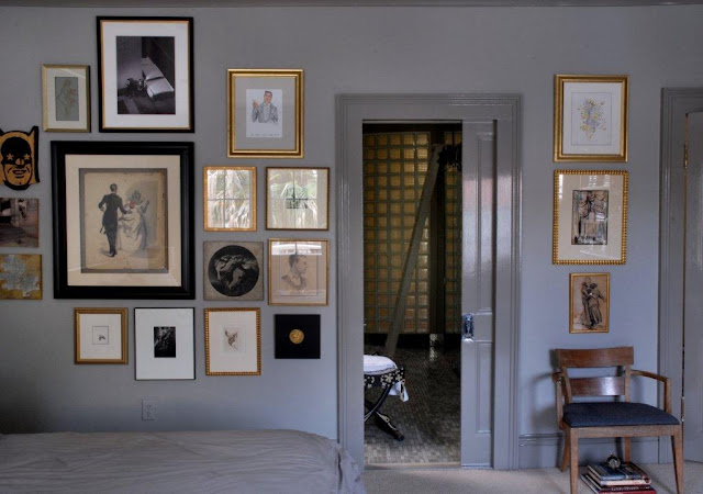
At home with Bryan Batt - he's gone greige!  photo by Kerri McCaffety

Karla Katz owns the number one shop selling French antiques on Magazine Street. As a shop owner and expert on antiques she is often asked about which colors to pair with the beautiful furnishings and objects she offers. 
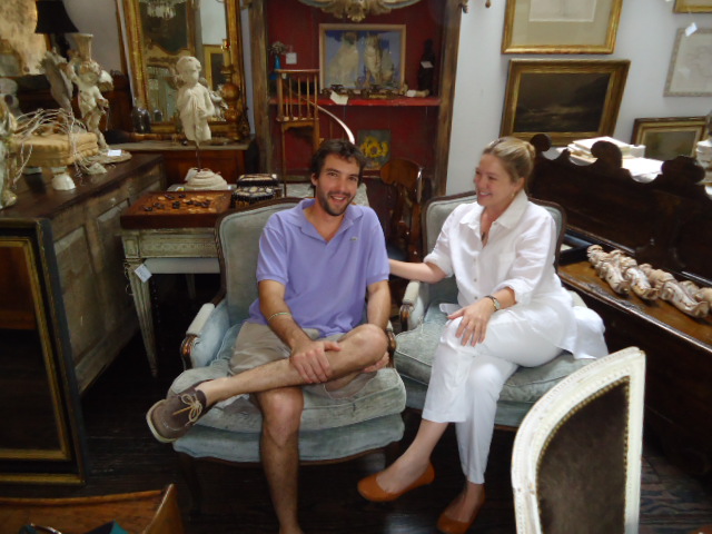
Karla Katz in her shop with her son David Katz - photo by Valorie Hart

Katz says that she sees interior color going back to a bright white in a flat finish. She loves to buy Benjamin Moore white paint that is in stock all the time, the white paint that is on the shelf. This way you always remember the color, and you can always get it for touch ups. She advises not to mix any tint into the off-the-shelf white. When you buy it as is, it has incredible mildew reducing properties that seem to diminish when pigment gets mixed in.

When asked if she has used trends like hot pink and turquoise, she said, “Oh God no!” But she did say that she would use hot pink in a heartbeat for a little girlʼs room. She also loves to use color in small spaces like powder rooms. “You can have fun, fun, fun with using color in small spaces. I love a dark slate blue gray with gold accents.”

Katz says that saturated browns and teals on trend in the last few years are out, and softer colors will prevail. She does not like a minimal look, and finds this type of interior design not interesting. She loves a room with a clean crisp palette that works wonderfully with interesting furnishings and accessories. If you can only afford one thing, choose one piece of really good art work, and have it framed properly. Great looking curtains in simple fabrics with a fabulous decorative trim is another layer of interest to add against white walls.

When asked what colors she personally uses in her home, Katz said she uses Benjamin Moore China White inside her house, and stock off-the-shelf white for her shop interior, and for the exterior of her shop and home. She is going to freshen up the inside of her house, and is switching from China White to Benjamin Moore stock white paint. 
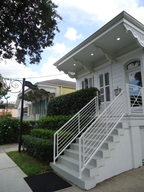
The shop of Karla Katz where she uses stock white Benjamin Moore paint - Note the white banisters and railings and shutters photo by Valorie Hart

Joey Helm, the owner of Helm Paint has been mixing colors for designers and home decorators in New Orleans for many, many years. Who better to to weigh in on what he thinks will be happening in 2012. Helm says Wythe Blue is the pick for color of the year by Benjamin Moore. It is a muted blue with gray undertones that is serene, aquatic, and evokes the earth, water, and wind. 

Joey Helm from Helm Paint says that Benjamin Moore Color of the Year for 2012 is Wythe Blue, that has gray undertones -photo courtesy of Benjamin Moore

The most popular colors sold in New Orleans are from a collection of historical colors, researched by Benjamin Moore from colors used in the 18th and 19th century in Colonial America. Of these a mid tone called Bleeker Beige is the most popular. It pairs well with White Dove and Ballet White.

Helm notes that customers choose safe colors that they are comfortable with. He forecasts more color being used in 2012. Two of his personal picks are Dry Sage and a deep gorgeous red called Caliente. He thinks that as long as colors have a gray undertone, they will be user friendly.

There are three collections at Helm that are being presented: “Color Preview” which consists of clear,
clean colors you find on the color wheel. “Classic Colors”, a grouping of colors trendy in 1988 that have remained popular. The technology of the time did not afford the clear colors being produced today so the 1988 palette is rich but muted. The third collection is a water based low VOC collection called “Affinity”. You can use  any three colors of the 144 colors in this collection together, making it the easiest one for home decorators to use.

Everybody wants to know what the paint store man has in his home. Helm has a traditional home where he uses sage green with Clean Fleece on the trim. He pairs the color with brown leather furniture, caramel color accents, and dark wood floors. Joey Helm says his personal favorite color is sage, and a Benjamin Moore rust color called Apple Crisp.

Forecasts and trend spotting are helpful and fun, but ultimately a collected, layered, and curated look that is personal and makes you happy is here to stay. Make pairing this with your favorite color, the color of your year.

____________________________________________________________
Thanks to Maria, Bryan, Karla, and Joey for taking the time to talk with me for this article, and as ever, thanks to Missy Wilkinson at CUE, and to Katy Danos from Hazelnut.


Please update your blog list with my new address:
http://thevisualvamp.blogspot.com, and become a Follower.
Thanks


Tuesday, May 31, 2011

French Twist

CUE Magazine June 2011 - interior decoration by Valorie Hart


I have been writing about one of my projects HERE, and have the great fortune to have it recently published in the June 2011 issue of CUE magazine HERE.


It's been a wonderful project, and it is so nice to see it published. Writer Lee Cutrone did a great job of telling the story; photographer Greg Miles took amazing photos; editor Missy Wilkinson steered the story and layout to an amazing result.


Thanks to perch. for the support and gorgeous fabrics and furnishings. And thanks to Nicole Cohen of Sketch42 for the rock star tray she made for this project.

Some things did not make it on page, like a credit for Jack Mayberry who was commissioned to do the awesome painting in the living room shot.


CUE is the pride of New Orleans, the local lifestyle magazine that could hold its own on the national level with its excellent features on fashion and home decor. And I am always very proud when they include me!


Alas, the dining room ended up on the cutting room floor
It didn't fit in with the layout
But I wanted to show you a picture from my records
A new Louis St. Lewis painting was added...


...and of course that wonderful Mouille chandelier
with the Milo Baughman chairs reupholstered in Kelly Wearstler fabric
I'm sure Greg the photographer has better photos
than I took with my "Barbie" digital camera ha ha

Thursday, October 15, 2009

The New Formula

Decorating has always had a great feminine influence, mainly because the chore of putting a home together falls upon the lady of the house.
Lately, and evolving since 2005 or so with the advent (and demise) of Domino Magazine (the bible of chick decorating), there is a distinct style that I call Chic Chick Decor. It's a style almost like a diet drink, sort of "decorating light."

1. Mix up the eras

2. Antique style furniture covered in Ikat is typical

3. The ocelot print rug has replaced leopard
as the glam rug du jour

4. A low credenza
(vintage or at least vintage in style)
with a pair of interesting vintage lamps is a must

5. Use at least one piece of Lucite

6. A large piece of Chick Art finishes the look

7. Using color is also key


9. A pair of Murano lamps - vintage preferred

10. Statement headboard

11. Hotel style bedding

12. Note the Ikat bolster

Mixing vintage, contemporary, and antique furnishings and accessories is the thing to do.
And mixing things high and low also contributes to the charm and accessibility of this design scheme. Also decorating with the same skills you use when putting together a fashionable outfit translates well.


12. Turned wood Swedish/French style chandelier
has gone mainstream

13. Vivid prints on chairs is expected

14. Note the over scale Chick Art again


Young moms and wives from their 20's to 40's are especially adept at this style, though it's a style that crosses over to all ages and both genders in its appeal.


15. Graphic wall paper used on at least one accent wall

16. Monogrammed linens

17. Note the statement headboard

18. Over size lamp(s)

19. Use of vivid color again


The same elements occur and recur. While it still looks fresh, there is a typical look to it all that borders on the expected.

I have used the example of a lovely home of a young family in New Orleans. This style is something that has been occurring en force in the post Katrina renewal and rebuilding process. More young people have moved here, and many young people from New Orleans returned to rebuild. A wave of optimism washes over us, instead of waves of despair, and it is reflected in what I like to call New NOLA Style (with the sub heading: Chic Chick Decor).
You can see larger images HERE in the October 2009 issue of CUE Magazine.


20. Antique (or reproduction) chandelier

21. Silk drapes and return rods

22. Modern accessories
(note the modern vases on the table)


23. Louis style chairs
upholstered in modern graphic print


24. Note the large scale modern art
(usually in pastel tones)


25. Note the saturated color on the walls,
and the color on the ceiling


Wednesday, June 24, 2009

CUE Magazine July 2009 - Baby Boon

Here are the photos and text (lovingly retyped!) of the fabulous article about Caroline in the July 2009 issue of CUE. It is such a thrill to see the personal style of the guiding hand and heart of the interior design shop Perch in New Orleans recognized.
You can see the photos I took HERE. Make sure to click on them for a larger view to see all the details.


Text by Lee Cutrone
Photos by Eugenia Hall
Styled by Jack Mayberry, Valorie Hart, and Caroline Robert
Editor Kara Nelson

Caroline Robert finds inspiration and fulfillment in lots of things. She loves good food, music, and design as well as being around her dogs and loved ones. She enjoys traveling, the outdoors, estate sales, yoga, painting, and gardening.
Originally from Texas, Robert attended LSU and moved to New Orleans nine years ago. She married Andre Robert, a stockbroker, became a step mother to Andre’s children Remy, 18, and Raphe, 13, then opened Perch, a Magazine Street store, where she and staff members Jack Mayberry and Valorie Hart bring together a fresh blend of antique and new designs for the home. Life was good.

Nothing prepared her for the life-changing experience of having a baby. Now, she says, life is even better.
“I could never leave the house and be totally happy playing with him all day,” says Caroline, whose sweet, soft spoken voice is still tinged with her seventh generation Texas roots. “I talk to him all day, and he gives me this look like he’s saying, ‘I understand.’ He’s so expressive. I’m certain he’s a genius.”

Caroline jokes that since her son ELi was born in April, she’s made a divot in the sofa, one of her favorite places to sit and enjoy the latest addition to the family. But it’s not likely she’ll sit still forever. She’s already introduced Eli to her business, bringing him to work and rocking him to sleep in a cozy space, which she’s dubbed “the butter-churning room.” Though thoroughly renovated by the Roberts, the 1860’s cottage that houses Perch still retains plenty of 19th-century charm, and tourists frequently comment that the shop offers an interesting window into the grand past of New Orleans homes.

Built in 1906, the Robert’s Uptown home is a wonderful piece of history as well. Designed by the architectural firm of Debuys and Levy, it features a deep porch supported by colossal white columns, high ceilings with ornamental plaster work, leaded glass windows that glisten like cut crystal, and plenty of green space for a child to roam. Caroline has touched both the house and her store with a light and airy hand that incorporates her trademark elements: natural motifs like nests and branches, touches of robin’s eggs blue (“I call it Perch blue,”she says of the hue used on her store’s logo), distressed antiques, sleek modernist pieces, custom curtains, fanciful lighting and a mix of antique and contemporary art.

She’s found her métier. Only now she looks at it through a slightly different lens - that of a mom. And her timing is right on the mark.

“I always think about a person’s lifestyle when helping with their home,” says Caroline, referring to the durability of things like washable slipcovers. “I want to make sure that whatever we do works for the way a person lives. But it’s interesting --all the things that are going on with designers and the children’s market. Almost every company is coming out with a line of baby stuff. I guess, as a result. I’m a little more drawn to to the whimsical.”

The whimsical is, in fact, where she started when designing her own nursery. The large room was already wired for two chandeliers, and Caroline began looking for two that would spark wide-eyed interest in a child. She settled instead instead for a crown like architectural remnant from a Catholic confessional from Bush Antiques, and a modernist chrome fixture she calls the asteroid fixture -- two completely different looks that typify her love for mixing periods. Caroline also included a Belgian carousel horse, a praying mantis rocker and a zinc-covered sideboard (used as a changing table), all from Perch, as well as the rocking chair her mother-in-law used with every one of her nine children, a photograph of her grandfather as a baby in 1910 and antique toys found by her mother, who passed on her love of antiques to Caroline.

Other aspects of the room are designed to extend beyond babyhood. Pale blue-and-white linen curtains are simple enough for any age, the sunny sitting room now uses as a space for mother and child to spend time eventually will become a playroom.

“I think it is very important for every home to have an area that is devoted to quiet time for mom and dad to bond with their child,” Caroline says. “For us that space is the sun room, which is part of the nursery. It has windows that overlook the branches of an ever-changing Japanese magnolia and an old live oak. I love that our little boy will grow up in a room that feels like a tree house.”

Nature is a recurrent motif in Caroline’s life. A self-described nature girl, she loves the outdoors and is pleased with the new pool she and Andre recently integrated into the existing landscape, which includes traditional New Orleans greenery like gardenias, crape myrtles, roses, hydrangeas, and sago palms. “I love the fact that the pool sits in front of our rose garden,” she says. “Now the terrace and the pool are just extensions of our home. We spend time there every day.”

In fact, there are few spaces in the house where the family does not spend time on a regular basis. Though grand in scale and history, the home is filled with things that are casual, comfortable, and approachable. The same goes for her wardrobe. On a typical day, she reaches for jeans and flip-flops, mixed with chunky necklaces and rings and Chanel No. 22 perfume, the same fragrance her grandmother wore.

“I suppose my style is about taking something simple and classic and making it fresh and unique,” says the new mom, who now more than ever values the extra moments that an easy approach allows. “Having a child gives you a new, clearer perspective on life. Everything that might have seemed important before gets put into its place. If I have an extra two minutes to spare, I’d rather spend it it rocking him to sleep for a nap than worrying about how perfect my house is or if my makeup is just right.”

PS If you liked this story in CUE please check out my story published last October HERE.

Friday, October 3, 2008

CUE Magazine October Issue

Maybe you remember the photo shoot I did while everyone was getting ready to evacuate for Hurricane Gustav HERE and HERE
Well it came out this month in the October issue of CUE Magazine, and it looks great! I would like to thank the editor Kara Nelson, and the photographer Theresa Cassagne for not only doing such a wonderful job, but also for delaying their own evacuation plans to do the photo shoot.
You can go HERE to get the link to see it as it was printed, or you can read it here as I have reprinted it with the photos from the magazine.


Visual Vamp Revamp
By Valorie Hart

When I moved into my “new” home in the Irish Channel, being a decorator, I thought I’d just whip out a paint roller and be done with it. That’s what happened with 95 percent of the walls. But, for some reason, there was one wall color that I thought I had to live with just because it was there.
  My husband Alberto Paz and I bought a proverbial fixer-upper with a unique distinction: It was once a home for wayward girls. Maybe that’s being a tad overdramatic. Our house, along with several others on our block, was owned by The Methodist Home, which had used it as a group home for eight young women.
  It had been empty for a couple of years, but it still had all the trappings of an institution: fire alarms, electric exit signs, overhead factory-style fluorescent lighting, garish paint colors with painted-on Bible sayings — and the pièce de résistance, a sign over the door frame that read “No Firearms Permitted On These Premises.”
  My husband and the real estate agent thought I had lost my mind. I found this house on the Internet. I saw the potential; it just needed a good cosmetic makeover. Best of all, this lovely old house was in our price range.
  The exterior was attractive, yet looked every bit its century age, give or take a decade. But walk in the door, and you found a jumble of well-intentioned but botched face-lifts. The bones were good, but the lady was showing her age.
  So we cleaned and scrubbed, took down one teensy wall and decorated. We renovated a bathroom, fixed up the kitchen and planted an old-fashioned garden.
  Alberto put his skills as an electrical engineer to good use getting rid of all those exit signs, alarms and fluorescent lights and replacing them with my collection of cute chandeliers.
  We love color and painted every room in the house except for the living room. It was the last room to be done, having been used for storage and a staging area as we worked on the rest of the house. The walls were a cheery shade of yellow, and the paint was clean and in pretty good shape. We were exhausted, so we left it, thinking we’d get back to it later.
  Four years later, the room was still yellow. I had built more than one decor scheme around that yellow. I did pink and yellow, orange and yellow, turquoise and yellow. Slipcovers went from white to a black-and-white toile print, which I then over-dyed in pink. Throw pillows and lamps came and went in revolving-door fashion. Curtain panels hit the dye bath, too. I kept eBay sellers happy as I tried to dress the room younger in Hollywood-Regency, last-century cute. I think I bought and resold every iconic mid-century chair out there. I kept moving furniture around and around. Ditto for the art on the walls. I did anything and everything to make this room work — everything but paint the dreaded walls.
  There was nothing really wrong with the yellow; it was actually very pretty in the morning light. But there was nothing really right about it either.
  I hemmed and hawed about choosing a new color for this living room. (We have two living rooms, something quite common for a double-shotgun house that’s been converted to a single family home.) We use the other, adjoining living room as a dance parlor. Yes, that’s right, a dance parlor. Alberto and I are Argentine tango teachers; we wrote a book about it called Gotta Tango. We met 15 years ago. I was a New Yorker and he an Argentine gentleman from California. I was taking tango lessons for fun in New York (where I had my business, Valorie Hart Designs), and he was teaching tango in San Francisco (part time, as he was also an engineer working in Silicon Valley). We met at a one-week tango workshop at Stanford University.
  It was something akin to what the French call coup de foudre: a clap of thunder, love at first sight. I left New York to be with my tango man. We put our careers on hold and became teachers together, produced 10 tango festivals and a multitude of events, traveled all over the world teaching workshops and published a magazine about Argentine tango. We moved to New Orleans in 2000, where we teach tango (and I continue to take on decorating projects). Our book, about the structure of tango dancing, was published this year by Human Kinetics.
  But I digress.
  I like color. I am not afraid of color. Paint and a little box of hair color are cheap and can be changed. Still I couldn’t make up my mind. I was seduced by all the beiges, grays and whites I see at the beautiful Villa Vici shop on Magazine Street. I had almost settled on a color called “studio beige,” but I wasn’t swinging a paint brush yet. I loved the colors at Juliet and Hazelnut, also on Magazine Street. And I could just move into and live in my favorite shop of them all, Perch. What color to choose?
  And then Interior Design 101 came out of the recesses of my pea brain (I am a Parsons school of Design graduate, for goodness sake), reminding me that adjoining rooms look larger when they share the same paint color. Duh. We had already painted the dance parlor a sexy shade of brown, what I call “Billy Baldwin brown,” and we just love it. Voila! I had my color.
  One night I decided to paint just a little swatch on the wall and to live with it for a couple of days, check it out in different light. But then I just kept going, and by four in the morning, the room was nearly finished. My husband was impressed but not surprised.
  From there the makeover was a breeze. We wanted to get a new couch, but every couch we looked at in a price range we could afford was ugly, ugly, ugly. So I decided to keep our vintage camelback with the Chippendale legs and have it reupholstered in faux white leather with nailhead trim. It’s the right scale. It’s comfy. And now it looks great. Leonel’s Upholstery in Kenner did it.
  Problem two was furniture placement. It’s a small room with either doors or windows on each of its four walls. I wanted to place the couch in front of the inconsequential window, the one that faces the side of the house, but it’s off-center and makes everything you put in front of it look unbalanced.
  What to do? In my best Lucy-Ricardo scheming way, I tried to figure out how to stretch the grocery money to buy an 8-foot-high, 9-foot-long Chinese Coromandel screen to put behind the couch. Then I remembered some old shutters we had taken off the house, and there was my foil for the unbalanced room. I cleaned them up, keeping them just tattered enough, and then convinced Alberto to hang them. He thought I was nuts, but he went along with it and, of course, bowed down to my design genius when we viewed the result, ooh-ing and ahh-ing.
  A mix of things I already had — a Philippe Starck Ghost chair, a vintage 9-foot-long Baker credenza, two sweet little tables, a rusty antique drinks cart, a distressed mirror dragged in from the garden, rescued lamps from a trash pile on St. Charles Avenue, a vintage Eames chair and a gold wheat sheaf table — all looked new again, and perfect.
Next to an Italian gold-leaf wheat sheaf base table circa 1970
is a vintage leather Eames chair and ottoman
that my mother bought about 40 years ago

I added a new, over-size lantern to replace a petite chandelier, and a fab black-and-white cotton Dhurrie rug from Pottery Barn. (I swear it looks just like a Madeline Weinrib rug.) I splurged on a pair of spectacular custom-made Ikat pillows from Perch on Magazine Street.
  The inside of the house is finally done (except for an ongoing bathroom renovation), and now I spend a good deal of time on my decor blog, Visual Vamp (www.visualvamp.blogspot.com). I started the blog as a way to combine my expertise in design and decor with the daily discipline of writing. I once thought blogging was for nerds and geeks, but I have come to discover that there are a lot of great blogs out there with posts by a slew of talented editors, designers and writers.

Planet Tango (875-0526; www.planet-tango.com)
hosts tango night every Wednesday at
LePhare (523 Gravier St.)
Beginners class 7 PM; Intermediate class 8 PM; Tango Dancing 9 p.m. to Midnight
For more information about the Visual Vamp blog (www.visualvamp.blogspot.com)
or about Valorie Hart Designs, call 289-8970 or email mizvtheb@yahoo.com.


Valorie’s Tips

A few tips to help you stay within your budget and still give your old girl a good makeover.
  • Look to decor books, magazines and blogs to get an idea of what you want.
  • Use flat paint; it hides complexion flaws.
  • Don’t be afraid of color, especially deep, sexy color. (Color does not make a room smaller. If a room is small, it’s small.)
  • Use what you have. Rotate it, that is, put some stuff away to use another time, or in another room. Reupholster. Dye slipcovers. Everybody’s going green, and using your old stuff in new ways is as classically green as it gets.
  • Edit without fear! It’s like putting on all your accessories when you get dressed, looking in the mirror and then taking at least one or two off.
  • Paint a piece of furniture with the same color you used on the walls. (This is an old Dorothy Draper trick.)
  • If you can afford to buy the best, do it. If not, don’t freak out. There are so many good things at great prices out there. Talk to local shop owners. They are often willing to work with your budget. Shop on-line, too. You can find great deals, many with free shipping, and often with no state sales tax .
  • Splurge on a couple of luxury items.
  • Save money by making your own curtains. The windows in old houses are so big that no off-the-rack curtains ever fit. Use iron-on Stitch Witch to make rod pockets.
  • Make sure your area rug is not too small. An 8-by-10 usually works for most rooms. Skip the 5-by-7 size; it always looks dinky.
  • Use what you really love, and ditch anything and everything that you hate.
  • Think outside the box. Get Lucy with it, and you’ll come up with at least one truly unique-to-you piece.
I think everybody makes little altars in their homes,
whether they know it or not.

Dresser tops and mantles become a catch-all for favorite things,
and before you know it you have a little altar dedicated to your life.
Mine started out with just a few things
on the antique corner table from Mexico.


Since this is a century-old house, there are no closets.
So we turned an extra room next to our bedroom
into a walk-in closet and dressing room.
There's space for everything,
including our growing collection of Carnival wear.
Our dog Cholo is sitting on a Dolce and Gabanna leopard-pring chair from Perch.
The painting of Marilynn is by New Orleans Artisit Mario Ortiz.
You can see a better photo HERE


I created an accent wall in our bedroom by padding
and covering it with natural burlap
and trimming it with rope from the hardware store.

The headboard is made from two parts
of an 18th century directoire day bed.

The mid-20th century painting above the bed
is by the artist known as Carlo Of Hollywood.


Favorite things:
A platter made especially for me
by master potters Philip Maberry and Scott Walker

The book my husband and I just published comes with an instructional DVD.

Turquoise satin concealed platform peep toe sling backs, my dance shoes du jour
Large antique majolica pitcher
and my favorite perfume, Todd by Todd Oldham.