Wednesday, August 31, 2011

Moving Art

There have been a couple of photo shoots at my house. That and the subtle feeling that the seasons are changing, got me moving things around again. Well, actually it's more like being a restless crazy decor maven, something you might know a thing or two about.

Sabina suggested I move the art around. So I did, and here a couple of photos. Where have all of you moved your art around to these days?

Moving art in the living room, - Symmetry rules the day! Swedish antique demi lune tables from Karla Katz. - This is the first time I have flanked this couch with a pair of lamps - "Quiet" art placed, not hung - Shades of white tell the story - Framed drawing (a portrait of moi done in 1985!) on the right by fashion illustrator  Mats Gustafson - All of the art was flipped from one side of the room to the other - Photo of the room by Valorie Hart


This is the view of living room with the way the art was hung before - It was more colorful -  Zak hot pink  tray - The portrait entitled "Audrey" by Ashley Longshore dominated one side, while a large  lithograph by Will Barnet entitled 'The Young Couple" balanced the other side of the couch - smaller portraits were stacked over the larger -The hot pink tray and the bold graphic pillows were changed out for a more quiet look as seen above - photo by Valorie Hart


The smaller portraits that were once stacked above "Audrey" and "The Young Couple" are now placed on the mid century Baker credenza, along with the portrait of a chair by Anne Harwell - The portrait on the left behind Anne's painting is of Michael Pelkey done by Letty Nowak  - "The Young Couple" now hangs where the portrait done of me by Mats was - The large lamps used to always be on this credenza, but I prefer them on the demi lune tables now - I like the way the art along with the vintage anatomy charts (and yes that is a mask on one of the skeletons) frames the flat screen TV to form a casual gallery wall of sorts, making the TV almost seem like another piece of art - The more graphic pillow moved from the couch to the orange chair - I retired a pair of Ikat pillows that have been in the living room for three years to the master bedroom - photo by Valorie Hart

"Audrey" moved to the opposite wall of where she was - "Marilyn" by Mario Ortiz, and "Cholo" by Patricia Van Essche remain as they were - perfect!  "Audrey" looks wonderful here, with the back drop of the Union Jack armoire (painted by Alberto and gifted to us by Sabina) - another graphic pillow (both from Modern Market) lands on the second orange chair - the Saarinen coffee table now resides as end table (the bench I recovered in white patent leather is now the "coffee table" with more room for Cholo and Kitty Kitty Bang Bang to play, and it's great to put one's feet upon it as well) - The tall lamp was made in Toledo, Spain, one of many props I had made for an event I designed in Madrid some years ago - It's been used both as a floor lamp and a tall table lamp - photo by Valorie Hart   
A view of the opposite wall where both large portraits were flipped to - It's great to sit on the couch and look at these beauties photo by Valorie Hart

The long view into the living room - I think moving the art has changed it, don't you?


Another view of the living room to showcase the antique French settee - photo by Valorie Hart

So there you have it, the great art migration. Well not so huge really, since all the art stayed in the same room. But really, moving the art around is a sure fire and quick and easy way to refresh your rooms, and I thank Sabina for nudging me.

Portrait of The Visual Vamp Valorie Hart by Mats Gustafson

Friday, August 26, 2011

National Dog Day

Today is National Dog Day! Post a pic of your pooch!

Cholo - Photo from the book Undecorate, photo by Melanie Acevedo

National Dog Day is celebrated August 26th annually and serves to help galvanize the public to recognize the number of dogs that need to be rescued each year, and acknowledges family dogs and dogs that work selflessly each day to save lives, keep us safe and bring comfort. Dogs put their lives on the line every day - for their law enforcement partner, for their blind companion, for a child who is disabled, for our freedom and safety by detecting bombs and drugs and pulling victims of tragedy from wreckage.

Hawkeye stays by his master's side

Thursday, August 25, 2011

Dorm Room Or Haute Decor?


Dorm room decorating is happening, bigger than ever, as college kids and their parents try to create Domino inspired jewel boxes for the ultimate home away from home experience.

Wall decals are in the arsenal for sure, and you either love them or hate them. The photo above is probably a wall painting that looks like one of those wall decals. The room was done by Mary McDonald (who I love).  Does it make you like wall decals any better?

Really! All you dorm decorators out there take note. Graphic pillows and curtains, and a black and white rug, and a carefully chosen wall decal could give you a look like this high style, high end room.

Wednesday, August 24, 2011

JAMIE - To Drop This Fall

Valorie Hart wears vintage leopard and writes about leopard for Jamie Herzlinger - photo is an old Polaroid

Today I am a guest blogger for Jamie Herzlinger.

Jamie is a terrific designer, a stylish woman, and a generous talent.

My post is all about leopard, and you certainly can't change this old vamp's spots!
Please take a look HERE.
And while you are at it check out my leopard shopping post at Houzz.

The post for Jamie ties in with an exciting new project she is about to launch. And you are hearing about it here first!

JAMIE LOVES is a magazine about luxury that supports what JAMIE IS.
Her newest project that I am proud to announce here is JAMIE, a design service where you can work on your home, buy couture clothing, buy tabletop, and buy to the trade only furnishings! 

JAMIE - It's about luxury and not having to whisper it - It's geared to people like you and me who love luxury, who love beautiful things that JAMIE will make reachable not just  aspirational - I can't wait!

From Jamie Herzlinger: It’s a really exciting time. JAMIE will go live this Fall and promises to be quite a new revolutionary way to approach interior design!

For years people have written to me with questions regarding design, and wanting to work with my firm in places all over the country. Well, after a solid couple of years working on the platform, I have designed a way that we can work with anyone, anywhere in the world, on the foundations of any project. Without ever having to step foot in your home!

JAMIE marries fashion and interiors to make and meet the expectations of those wanting to  re-design a single room to an entire home, to a paint palette for one room, to the experience of being able to purchase a coveted Chloe Jacket or buy the most sought after Dorothy Thorpe candlesticks! At the same time, you can purchase a stunning set of Italian Sheets and totally order the hottest in French flatware for your table.

JAMIE answers your question of what to do with all the inspirational photos that you have ripped out of Elle Décor, Architectural Digest, Traditional Home and House Beautiful, you know the ones, where there is that certain perfect piece you have to have, but you need a designer to get if for you.

JAMIE offers you the hassle free answer to purchasing that one piece or twenty “one pieces” without having to hire an interior designer in hopes that they will be willing to just act as a buying service for you! JAMIE is also your buying service.

JAMIE is the design and style that gives you the power to change your life!

____________________________________________________________________

Readers and Bloggers, can we give Sister Jamie an AMEN?!  Yes indeed! AMEN!                          

Tuesday, August 23, 2011

Amazeballs! The Flower Ball Chandelier

Flower ball chandelier in the bedroom of The Visual Vamp - Duvet by Dwell Studio - photo by Sara Essex Bradley

Way back in 2008 an exciting chandelier arrived in the market place. It was a chandelier in the shape of a huge ball, a riff on the mid century Sputnik light fixture. The new form had spokes emanating from a center sphere with some form of decoration attached at the end of the spoke. The one I fell in love with back then was the Flower Ball Chandelier.

Today I am sharing a round-up of ball style chandeliers, and telling you my story. Maybe some of you have a chandelier like this too, and a story to share with us.

Flower Ball Chandelier - This is the one I have -  The flower ball chandelier has a nice feeling of modern and vintage. - Each glass flower is like a vintage pressed glass plate your granny might have had - photo via Coco + Kelly

I worked in a shop then, and one day when I was tidying up the fabric room with the manager, I asked about a box filled with pieces of chrome rods and glass flowers. He told me it was a chandelier that was defective, that it was a real lemon because it always had problems, like not working when it was installed. I asked why it was not being returned to the vendor, and he just shrugged. I asked if I could buy it at cost. Alberto is an electrical engineer so I thought maybe he could fix it.

Steven Gambrel uses this enhanced Sputnik style chandelier

At first it was installed in our dressing-room-walk in closet. Many people with old houses that have no closets, and turn an extra room into a closet. I thought the flower ball  chandelier would be so glam in our dressing room, and it was. It did have issues, and we had to buy a new transformer. The chandelier was heavy and ginormous (about 30" in diameter) and tricky to hang. You have to screw in each spoke to the center ball and attach each one of the glass flowers. I think there are over 50 flowers!

A pair of ball chandeliers shown at the fab blog La Dolce Vita

It worked for about a year and half, and then one day it just didn't. We changed the fuse on the chandelier. We checked circuit breakers in the house. Nothing would bring it back to life. I talked with a woman who owns an electrical supply company and she told me that any type of chandelier using a transformer box along with halogen light bulbs is subject to quirks. Just a slight vibration overhead (like someone walking on a second floor), can make the transformer stop working.

Flower ball chandelier in a living room - I saved  this image over a year ago via????

It was such a hassle to take the thing down, and even though I bought it at cost, it was too expensive to discard. I threw a floor lamp in the closet, and that along with a pair of lamps on my vanity, was all the light we had for at least another year. Finally I disassembled the flower ball, removing each spoke and flower. Alberto took down the main frame electrical part, and I had him move the vintage French style chandelier from our bedroom to the closet.

A more classic closed cage type of ball chandelier

I had the idea to move the flower ball to our bedroom. We ordered a new transformer. We still didn't know if this would solve the problem, suspecting that maybe there is faulty wiring inside the sphere. We planned to take it to our local chandelier repair shop (All Wired Up), because Alberto didn't want to tackle it.

Classic string style ball chandeliers that have been around since the 1950's

Of course a few months went by, and we just never took the thing to be repaired. I said I didn't care if it worked or not because we never use the overhead light in our bedroom, and that the actual sculptural quality of the piece was pretty enough onto itself.

Glass beaded ball chandelier 

A photo shoot of our home was scheduled, and that always makes us finish abandoned projects. However, not enough time was available to repair the chandelier. So I asked Alberto to please just install the main frame without hooking it up to the electrical. I spent a few hours attaching the spokes and the glass flowers the night before the shoot. The flower ball looks wonderful in our bedroom, even though it's a lemon.

The most simple form - a large round paper lantern - who of us hasn't used this at one point in our decor life?

I still like ball chandeliers even though they are not trending so to speak. Maybe they remind me of the mirror balls in my old disco days.

Capiz shell ball chandelier


The flower ball chandelier in a breakfast area - LOVE it!

Do any of you have something in your house that no longer works, but you still keep it around because it looks pretty?

I love the flower ball chandelier in my bedroom - photo by Sarah Essex Bradley


Saturday, August 20, 2011

Belladoggie Second Line

Belladoggie is our new across the street neighbor, and we love them! Today, Cholo, Alberto, and I are joining their Second Line to help celebrate their grand opening. If you are in New Orleans, bring your dog and come to their other store Belladonna (Magazine at Sixth Street) at 9:30 AM today Saturday. Second Line rolls at 9:45.


Friday, August 19, 2011

Patina Style

Brooke and Steve Giannetti have a beautiful book out called Patina Style. It is a direct descendant of one of the most influential decorating styles that affected a huge swath of the general public.

Buy Patina Style HERE


That style is what became known as Shabby Chic, pioneered by Rachel Ashwell in the 1990's.  It was her style that launched a brand, and introduced the term into the vernacular of interior design.

Wikipedia says:"The term was coined by The World of Interiors magazine in the 1980s and became extremely popular in the US in the '90s with a certain eclectic surge of decorating styles with paints and effects, notably in metropolitan cultural centres on the West Coast of America, such as LA and San Francisco, with heavy influences from Mediterranean cultures such as Provence, Tuscany and Greece."

If you look at Rachel's work, you see a level of sophistication and an edited style that perhaps has been taken for granted. The beauty of Shabby Chic is its accessibility. Who among us has not felt empowered to paint it all white? The downfall of Shabby Chic was the perhaps corrupt interpretation of it by the very masses who loved it. It morphed into a busy cutesy style of the constant shopper who loved to do up rooms in a very forgiving fussy cottage style.

I first saw and fell in love with Shabby Chic in the 1990's in Los Angeles. Rachel Ashwell was there, and Lynn Von Kersting, and shops like Pom Pom and Le Maison. At the same time my friends Sharonne Einhorn and Honey Wolters opened the first Ruby Beets in the Hamptons (in New York), and everyone from Donna Karan to Barbra Streisand plundered their shop to create the romantic shabby chic interiors seen at Ruby Beets. I still have pieces I bought from that first Ruby Beets shop located on The Montauk Highway in Bridgehampton.

So now we have Patina Style. The images in the book are familiar if you are like me, a regular reader and fan of the blog Velvet and Linen. I don't mind seeing familiar favorite images over and over again. The publishing world has a weird aversion for re-showcasing things seen on blogs or in other publications. I think if something is good, we all love to look at it countless times. And every photographer and stylist interprets things differently.

You might recall a photo on the Giannetti blog of the living room Brooke decorated for their home before it looks the way it does today. It was classic shabby chic, ruffled white slip covers, and accents of chintz, and lots of white furniture. It was lovely.

A look inside at the pages from the book Patina Style

But all artistic types evolve, and so it goes with Brooke. She has developed her talent for interior design to the in demand status that it is today. Her partner in all of this, is of course her husband Steve, who is a talented and respected architect. He and Brooke have formed a perfect meeting of the minds in their aesthetic they call Patina Style.

Brooke Giannetti has made Patina Style the interior design du jour

Their Patina Style is evolved and getting more and more refined as they work on new projects. Touchstones of using the faded, chipped, tarnished, and tattered, along with the best of the most current building materials, and fabrics and furnishings available in interior design, combine to define the Giannetti Patina Style.

The book is lovely. Most of the photographs are done by Steve, truly a Renaissance man (architect, designer, painter, photographer, writer). Brooke and Steve write beautifully, and the book is organized with chapters that are both inspirational and useful. They share many decorating tips that they use, and that they make you feel you can try yourself.

From inside the pages of Patina Style

Most important, is that when you read the book or the blog, you like the Giannetti family. They live in  a golden place, and do work they love. They have a beautiful home, and a beautiful family. As a couple they seem very much in love and in like with one another. It is a story and a style and a success we would all very much love to be a part of, and of which they actually make us a part of via their blog Velvet and Linen.

From inside the pages of Patina Style

I cast a resounding vote that Patina Style will have the defining success that Shabby Chic had. It is time for the update of this interior design style for a new generation, and for those of us who loved it back in the day to revisit it again with the eye of experience. We don't get old, we acquire patina.

From inside the pages of Patina Style

Stop by and congratulate them!


Stay tuned for another post with a photo essay inspired by the Giannettis of my personal patina style.

The Visual Vamp Hearts Patina Style - photo by Valorie Hart


Wednesday, August 17, 2011

Tiptoe Through The Saarinen Tulips

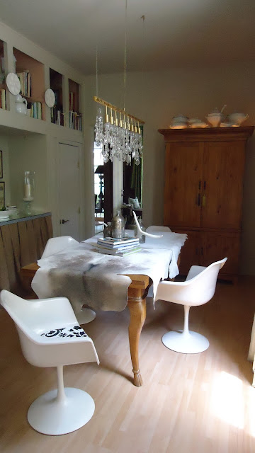
Thank you all for weighing in HERE on the dining room chair question. I had a photo shoot today, and of course that motivated me to make a change or two. Not only did I pick new chairs, I also moved the art around in the living room as Sabina suggested. Thanks to Jenny, Nicole, Mitchell, Brooke, Deborah and Renae for emails that went back and forth.

Jenny sent this photo for inspiration - The Saarinen Tulip chair is one I have always wanted

The Tulip chair mixes very well with antiques, just like the Eames Eiffel Tower chairs- Jenny sent me this photo too

 I brought this vintage Tulip chair home on approval - It had its issues - The depth of the seat is more narrow than the reproduction chars you can get online - But I loved the creamy patina on the vintage chair, and I love to buy vintage whenever I can - So I used it as my desk chair for a couple of days, and it was comfy enough - Realistically the dining room does not get used daily, except when I use the table as my office space - I sent this photo to my decor buddies, and we all liked this chair - There were no side chairs, only four armchairs, which fit under the table perfectly

The vintage Tulip chair had a seat cover that could be easily changed - This blue print, while historically accurate, reminded me of airport seating, so I changed it - I didn't have time to go shop for fabric, so I used something I had on hand
The vintage Tulip chairs have arrived! I recovered the seats with a black and white Suzanit print

This is how these chairs "live" daily - The dining room is small, more of a pass through nook, so there is no room for host chairs When we have a dinner party, I use an extra special host chair for Alberto, and another comfy one for a guest

The Visual Vamp dining room with vintage Saarinen Tulip Chairs

Anyone want to buy four oversize Parsons chairs with custom slip covers? email me!

Do you want to see how I moved the art work around?

Monday, August 15, 2011

HGTV Does The Double D Season

What is happening at HGTV? Design Star continues to be a snooze and a loose. The Novogratz came on board at HGTV this Summer and if you like them, you'll like their show. But there have been some sneak peeks to a couple of new shows in the Fall line up.

One involves Donna Moss who got kicked off of a previous season on  Design Star, and now has her own show. Donna is from Dallas and calls herself "The Queen of Bling". Really.  I just happened to see the sneak preview and let's just say that HGTV must be trying to create a Bravo type Housewives decorating franchise. You know, rich, over done women decorating, complete with drama and lots of bling and bad taste for us all to ogle and love to hate. Clever programming, or just tacky disaster?

From HGTV: "Donna Moss, a former finalist from season one of HGTV Design Star, is the host of the new series Donna Decorates Dallas. Each week Donna works with her two daughters, Tiffany and Ashley, along with a team of skilled artisans and craftsmen to create unique and timeless home interiors. As a former professional in the travel industry, Donna brings a global perspective to her designs. Her favorite design motifs include elegant Old World themes with glamorous Gothic tones and lush Hollywood-inspired rooms."

It's funny how on both Food Network and HGTV that some of "the losers" end up with a show anyway.

In the preview episode, Donna goes to a bloated Dallas McMansion of a house to add some new bedding to the master bedroom. The decor is high end Steinmart if you get my drift. The Queen of Bling immediately escalates the project to an entire room do-over, complete with knocking out walls, and managing to cram in about $50K (or more) of high priced junk from some design mart in Dallas.

There was also a side trip to another client's house who hated some chairs that had been placed there by Donna Decorates Dallas. The Queen of Bling and her assistant fixed it pronto! They took away the offending chairs, and brought in two tufted throne like chairs more in line with the client's hefty taste. Then they bedazzled them with large fake jewels that were hot glued into each tuft point.

It is so awful, that it is almost a joke, like watching movies my friends and I used to call "pig heaven" (that usually starred Pia Zadora). They were so bad we loved them. Well this room is so bad I thought maybe it was a "pig heaven" joke. But sadly, it is not that lovable.

Room design on HGTV by Donna Moss, The Queen of Bling, on her new show Donna Decorates Dallas

Does HGTV have a hit on its hands with Donna Moss? Will we all tune in every week to see what bad taste she whips up, and then snark it to death on the blogs? Or will we really not care. Stay tuned.

D #2 of The Double D Season, is none other than New Jersey Housewife Dina Manzo, who got out after season one on Bravo. She often told us she was an interior designer who also did event design HERE.

Dina Manzo interior designer and event designer

Her style is commensurate with her peers and her location and the environment they all live in.  I imagine in New Jersey, she is very successful.

Some of Dina Manzo's event design

And obviously so does HGTV. They snatched her up from Bravo. Tonight, she is a guest judge on Design Star, where the challenge is to create a wedding decor in two days. This appearance is a prelude to her new show in the Fall on HGTV called "Dina's Party".

The first episode on the new show is called: "A Big Pink New Jersey Wedding". Attention brides!

The weird thing is how Dina does her over-the-top event design in people's homes, turning a tacky home into a mini tacky catering hall.

A Big Pink New Jersey Wedding

This was the client's living room after Dina got done with it

Will  Dina bring back the ice sculpture?

The client's living room before it got transformed into "A Big Pink New Jersey Wedding"

Wowza! Excess and bling and bad taste!!!! Way to go HGTV! Your ratings will surely soar. I can hardly wait for Jenny and Nicole and Erica to weigh in!