Experts weigh in on trends for the coming year, and talk about what makes their color clocks tick.
 |
| CUE Magazine October 2011 |
 |
| CUE Magazine October 2011 |
This is the article in its entirety (some editing was done for space restrictions). It's so interesting to hear what Bryan Batt, Karla Katz, Maria Killam, and Joey Helm all have to say.
Color Me Happy
by Valorie Hart
Itʼs that time of year again, when color trends and pairings for interior design are forecast for the coming year.
Interior designers and decorators seem to have magical powers when it comes to effortlessly choosing colors for their clients, or for themselves. Blessed with the ability to see a room “done”, and being confident to take it there, is a talent.
Maria Killam is an internationally known color expert and designer. She spent four years with Benjamin Moore as a paint/color specialist creating exterior and interior palettes for architects, developers, builders, property managers and homeowners. She writes the popular blog: Color Me Happy.
When asked about the most requested color by clients, Killam says Benjamin Moore Gray Wisp is the most requested. On itʼs own gray is dreary, but it is an excellent foil for pairing with almost any other color. Benjamin Moore Paladian Blue, a muted blue with a turquoise green under tone, and muted greens, and whites are also among heavily requested colors.
A common mistake made is using the same color for the entire house. Killam wishes from “the depths of her soul” that the over use of one color in a home would stop. She would like to see a return to the days when each room had a unique color identity. To avoid this looking disjointed, a balance of clean and muted undertones is required, as well weaving a thread of one bit of color from one room to the next.
She also advises picking paint color last, after the furnishings and fabrics.
Killam says that people love color but are afraid to own up to it. Many of her clients will not even tell her what their favorite color is. She suggests buying a couch in your favorite color, instead of opting for the trendy neutral of the minute. Killam sees a return to white walls, but cautions that white rooms only work when you have abundant natural light. Unlike gray that needs other colors paired with it to keep it from feeling drab, white with the right light can stand on its own.
The colors she uses in her home consist of a sunflower yellow couch, paired with raspberry and Kelly green, with crisp black and white accents, all against a back drop of Benjamin Moore Natural Linen walls.
 |
| Maria Killam's sunflower yellow couch as seen in House Beautiful October 2011 |
Bryan Batt is a New Orleanian, who has a brand new design book called “Big, Easy Style” (written with Katy Danos), that is chock-full of gorgeous photos (by Kerri McCaffety) of homes uniquely decorated here in New Orleans. New Orleans has itʼs own special light that allows a grand across-the-board use of color, which Bryan shows many examples of in his book.
 |
| Big, Easy Style |
Bryan thinks that primary colors will come into vogue in a big way, whether in their pure forms or sophisticated interpretations. Combinations of red, blue and yellow can be extremely chic. He is never really swayed by trends, and says that he is always going to dip his brush back in he paint pot, and try what he likes.
 |
| Bryan Batt like primary colors for next year - from Big, Easy Style |
When asked what color he would like to see follow last years hot pink, Batt answered, “Beige... just kidding!!! Right now I am craving mossy greens and moody blues. But for me, the flip side of hot pink, is Kelly green and I am thinking about redoing a masculine wing chair I have in Kelly green linen”.
Battʼs dynamic style attracts dynamic clients, and his clients absolutely asked for hot pink last year, especially for accents and decorative pieces. He says that using an on trend color is a terrific way to easily update your look. “It is a big commitment to paint a wall in a fashion color, but I have a dear friend who recovered her sofa in hot pink velvet”. She used the New Orleans black and ivory toile from Hazelnut for window treatments for a fabulous pairing with the pink sofa.
 |
| Hot pink couch with New Orleans Toile drapes - photo by Kerri McCaffety |
Bryanʼs go-to Benjamin Moore colors are Barely Teal, Smoke Embers, Sea Life, Davenport Tan, Chocolate Mousse, and Cloud White. In his own home he has been known to be “color crazy”. His favorite phrase is "let's hit it with some color." His partner Tom Cianfichi has often said, "Can we please just wait for your color bruises to heal"?
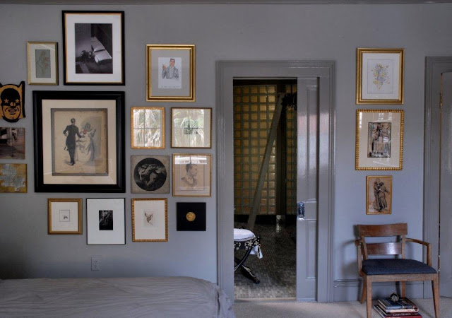
In their new home, Batt is exploring subtle shades of pale linen and deep saturated grays. He
loves how they pair and play together.
loves how they pair and play together.
 |
| At home with Bryan Batt - he's gone greige! photo by Kerri McCaffety |
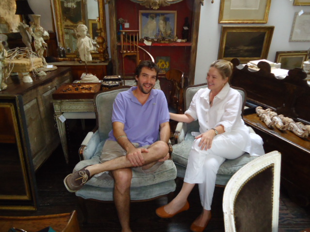
Karla Katz owns the number one shop selling French antiques on Magazine Street. As a shop owner and expert on antiques she is often asked about which colors to pair with the beautiful furnishings and objects she offers.
 |
| Karla Katz in her shop with her son David Katz - photo by Valorie Hart |
Katz says that she sees interior color going back to a bright white in a flat finish. She loves to buy Benjamin Moore white paint that is in stock all the time, the white paint that is on the shelf. This way you always remember the color, and you can always get it for touch ups. She advises not to mix any tint into the off-the-shelf white. When you buy it as is, it has incredible mildew reducing properties that seem to diminish when pigment gets mixed in.
When asked if she has used trends like hot pink and turquoise, she said, “Oh God no!” But she did say that she would use hot pink in a heartbeat for a little girlʼs room. She also loves to use color in small spaces like powder rooms. “You can have fun, fun, fun with using color in small spaces. I love a dark slate blue gray with gold accents.”
Katz says that saturated browns and teals on trend in the last few years are out, and softer colors will prevail. She does not like a minimal look, and finds this type of interior design not interesting. She loves a room with a clean crisp palette that works wonderfully with interesting furnishings and accessories. If you can only afford one thing, choose one piece of really good art work, and have it framed properly. Great looking curtains in simple fabrics with a fabulous decorative trim is another layer of interest to add against white walls.
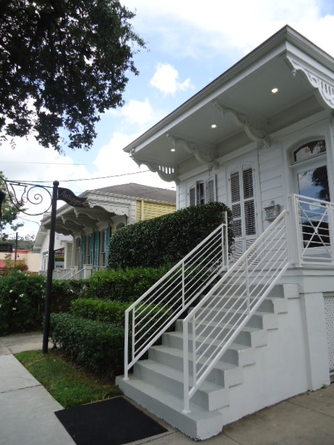
When asked what colors she personally uses in her home, Katz said she uses Benjamin Moore China White inside her house, and stock off-the-shelf white for her shop interior, and for the exterior of her shop and home. She is going to freshen up the inside of her house, and is switching from China White to Benjamin Moore stock white paint.
 |
| The shop of Karla Katz where she uses stock white Benjamin Moore paint - Note the white banisters and railings and shutters photo by Valorie Hart |
Joey Helm, the owner of Helm Paint has been mixing colors for designers and home decorators in New Orleans for many, many years. Who better to to weigh in on what he thinks will be happening in 2012. Helm says Wythe Blue is the pick for color of the year by Benjamin Moore. It is a muted blue with gray undertones that is serene, aquatic, and evokes the earth, water, and wind.
 |
| Joey Helm from Helm Paint says that Benjamin Moore Color of the Year for 2012 is Wythe Blue, that has gray undertones -photo courtesy of Benjamin Moore |
The most popular colors sold in New Orleans are from a collection of historical colors, researched by Benjamin Moore from colors used in the 18th and 19th century in Colonial America. Of these a mid tone called Bleeker Beige is the most popular. It pairs well with White Dove and Ballet White.
Helm notes that customers choose safe colors that they are comfortable with. He forecasts more color being used in 2012. Two of his personal picks are Dry Sage and a deep gorgeous red called Caliente. He thinks that as long as colors have a gray undertone, they will be user friendly.
There are three collections at Helm that are being presented: “Color Preview” which consists of clear,
clean colors you find on the color wheel. “Classic Colors”, a grouping of colors trendy in 1988 that have remained popular. The technology of the time did not afford the clear colors being produced today so the 1988 palette is rich but muted. The third collection is a water based low VOC collection called “Affinity”. You can use any three colors of the 144 colors in this collection together, making it the easiest one for home decorators to use.
Everybody wants to know what the paint store man has in his home. Helm has a traditional home where he uses sage green with Clean Fleece on the trim. He pairs the color with brown leather furniture, caramel color accents, and dark wood floors. Joey Helm says his personal favorite color is sage, and a Benjamin Moore rust color called Apple Crisp.
Forecasts and trend spotting are helpful and fun, but ultimately a collected, layered, and curated look that is personal and makes you happy is here to stay. Make pairing this with your favorite color, the color of your year.
____________________________________________________________
Thanks to Maria, Bryan, Karla, and Joey for taking the time to talk with me for this article, and as ever, thanks to Missy Wilkinson at CUE, and to Katy Danos from Hazelnut.
Please update your blog list with my new address:
http://thevisualvamp.blogspot.com, and become a Follower.
Thanks
Thanks
Fantastic article, Valorie! I'm the color section of my decorating course right now...in fact I have to go buy some watercolors for an assignment -- can't wait!
ReplyDeleteCongrats on a great article published, Valorie! You're so talented and I am in love with the pink couch. xo
ReplyDeleteGreat article Valorie! Thanks so much for including me!
ReplyDeletexo
Maria
i wish you would go to Karla's house and photograph it. i remmeber her old one was on hgtv years ago and it was fabulous!!!!!!!!!!!
ReplyDelete